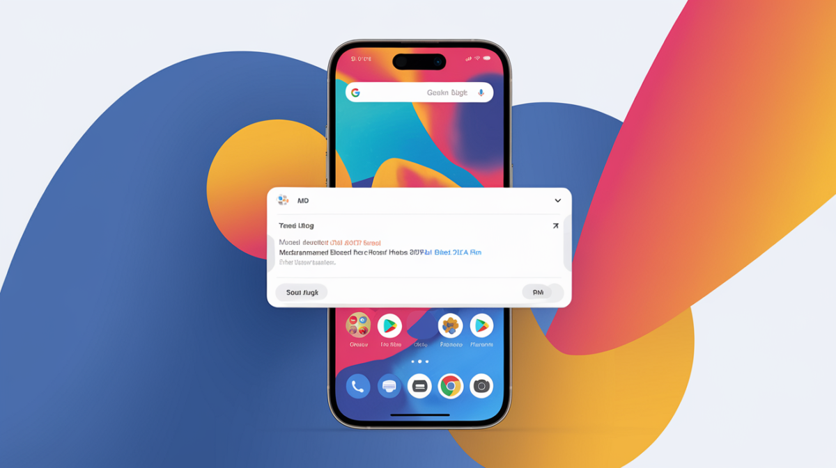
Google Chrome for Android has finally rolled out a highly anticipated feature: the ability to move the address bar to the bottom of the screen. This update, part of Chrome version 135, is designed to improve usability, particularly for users with larger devices or those who prefer one-handed browsing. The change marks a significant shift in Chrome’s user interface, aligning it with design trends seen in other browsers like Samsung Internet.
Why the Bottom Address Bar Matters
The bottom address bar is more than just a cosmetic change—it’s a usability upgrade. Here’s why it’s making waves:
- Easier One-Handed Use: With smartphones growing larger, reaching the top of the screen can be cumbersome. The bottom placement makes navigation more accessible.
- Consistency with iOS: Safari on iOS has long featured a bottom address bar, and Google’s move brings parity to Android users.
- Improved Ergonomics: Studies suggest that bottom-aligned controls reduce thumb strain, making browsing more comfortable.
How to Enable the Bottom Address Bar
Switching to the bottom address bar is simple. Follow these steps:
- Open Chrome on your Android device.
- Tap the three-dot menu in the top-right corner.
- Navigate to Settings > Address Bar.
- Select “Bottom” to move the address bar.
If you change your mind, you can revert to the top address bar by following the same steps and selecting “Top” instead.
User Reactions: A Mixed Bag
The update has sparked varied responses from users:
- Positive Feedback: Many users, especially those with larger phones, praise the change for making browsing more intuitive. “It’s a game-changer for my Pixel 7 Pro,” one user noted.
- Negative Feedback: Some long-time Chrome users prefer the traditional top address bar, arguing that the bottom placement feels unnatural or less efficient.
Bottom vs. Top Address Bar: A Comparison
Here’s a quick comparison of the two layouts:
| Feature | Top Address Bar | Bottom Address Bar |
|---|---|---|
| Accessibility | Harder to reach on large screens | Easier for one-handed use |
| Familiarity | Traditional layout for Chrome | New for Android, common on iOS |
| Customization | Default for years | Optional, user can switch |
What This Means for the Future
Google’s decision to introduce the bottom address bar reflects a broader trend toward ergonomic design in mobile apps. As screens continue to grow, expect more interfaces to prioritize ease of use. For now, Chrome users have the flexibility to choose what works best for them—a win for customization.
Whether you’re a fan of the change or not, one thing is clear: Google is listening to user feedback and evolving Chrome to meet modern needs.